The Fallacy of the Perfect Match
In the world of interior design, there is a persistent, nagging impulse to make everything ‘match.’ People spend hours holding fabric swatches against paint chips, trying to find the exact shade of teal that mirrors their throw pillows. When it comes to Venetian glass, I believe this approach is not just a waste of time—it is a fundamental misunderstanding of the medium. Murano glass isn’t a textile or a wall coating; it is a living, breathing interaction with light. If you are choosing a piece of Venetian glass simply because it matches your rug, you are missing the point of owning a masterpiece.
In my perspective, the most vibrant homes—the ones that actually feel curated rather than merely decorated—are those where the glass stands in defiance of its surroundings. Venetian glass is meant to be a protagonist, not a background extra. When you try to match it too closely to your existing palette, you effectively camouflage the craftsmanship. You mute the very glow that makes Murano glass legendary. To truly honor this centuries-old art form, you have to stop thinking about coordination and start thinking about conversation.
Why Neutrals Are a Disservice to Murano Craftsmanship
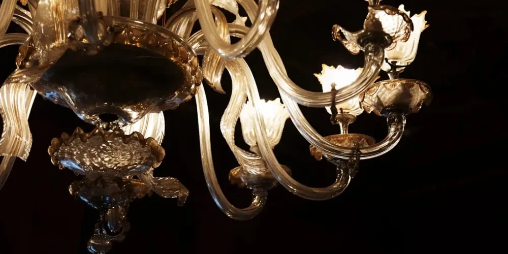
I often see homeowners gravitating toward clear glass or ‘safe’ ambers and greys because they are afraid of making a mistake. While there is a place for cristallo, I find that many people use neutrality as a shield against commitment. If you are investing in a piece of authentic Italian craftsmanship, why choose a color that disappears? The artisans of Murano spent centuries perfecting the chemistry of minerals—using gold leaf to create rubino (ruby red) or cobalt to achieve deep blues.
Choosing a ‘neutral’ piece just to ensure it ‘fits’ feels like a missed opportunity. In my view, a room filled with muted tones is precisely where a bold, blood-red Venetian vase or an emerald green chandelier should live. The glass should provide the punctuation mark at the end of the sentence. If your room is a sea of beige and you add a beige glass bowl, you haven’t designed a space; you’ve created a void. The glass should be the spark that sets the rest of the room on fire.
Let the Light Dictate the Hue, Not the Furniture
One of the biggest mistakes I see is choosing glass colors based on a static environment. People look at a piece in a brightly lit showroom or on a computer screen and assume it will look the same on their sideboard. It won’t. Venetian glass is an optical instrument. Its color is a result of how it traps, bends, and releases light.
The Morning vs. Evening Shift
Before you commit to a color, you must consider the orientation of your room. A deep amethyst piece might look regal and rich in a south-facing room flooded with afternoon sun, but in a dark, north-facing study, it may simply look like a black silhouette. I argue that the ‘right’ color is the one that reacts best to your home’s specific light cycles. A warm ambra (amber) can make a cold, dimly lit room feel like it has its own internal sun, whereas a cool acquamarina can temper the heat of a sun-drenched terrace.
Three Rules for Choosing Color with Conviction
If we are going to abandon the ‘matching’ myth, we need a new set of criteria. I suggest following these principles to ensure your Venetian glass feels like a deliberate choice rather than a safe compromise:
- The Rule of Conflict: Look at your primary wall color and find the opposite on the color wheel. If your walls are a warm terracotta, look for deep blues or teals. This conflict creates a visual tension that draws the eye directly to the glass.
- The Rule of Depth: Avoid ‘flat’ colors. The beauty of Venetian glass is its internal layering. Look for pieces that use techniques like sommerso, where layers of different colors are submerged under clear glass. This adds a three-dimensional quality that no ‘matching’ solid color can provide.
- The Rule of the Hero: If you have a collection, don’t buy five pieces in the same color family. I find that a collection of glass in varying, even clashing, jewel tones looks far more sophisticated and ‘collected’ than a monochromatic set that looks like it was bought from a single catalog page.
The Myth of the ‘Trend’ Color
Every year, we are told what the ‘color of the year’ is, and inevitably, we see a surge in glass production matching that trend. I strongly suggest you ignore this. Venetian glass is timeless; trends are fleeting. If you buy a piece in a ‘trendy’ shade of millennial pink or sage green just because it’s popular right now, you are treating a legacy object like a fast-fashion accessory.
Instead, choose colors that evoke a personal response. Does the deep blue remind you of the Venetian lagoon at dusk? Does the gold-flecked avventurina remind you of a specific sunset? That emotional connection will outlast any interior design trend. In my experience, a piece of glass chosen with conviction—even if it ‘clashes’ with your current sofa—will eventually find its place in every home you inhabit for the rest of your life. The sofa will be replaced; the glass will remain. Choose for the soul of the object, not the current state of your living room.
Final Thoughts: Courage Over Coordination
Ultimately, choosing Venetian glass colors is an exercise in courage. It requires you to trust your eye and your intuition over the ‘rules’ of traditional decorating. Stop asking yourself if the glass ‘goes’ with the room. Instead, ask if the glass makes the room more interesting. Does it command attention? Does it change the way the light hits the floor? If the answer is yes, then you’ve found the right color, regardless of whether it matches your curtains or not. In the world of Murano glass, the boldest choice is almost always the correct one.
Related Posts
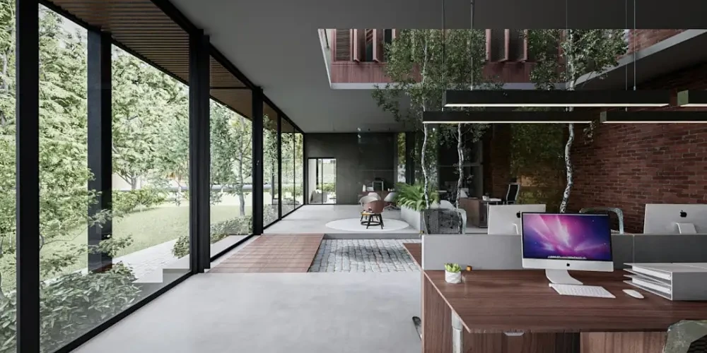
Why biophilic rooms actually feel more natural with Venetian glass
Discover how Venetian glass enhances…
Why Venetian glass is what actually makes an eclectic room work
Discover why Venetian glass is the…
Why the act of curating glass feels like preserving a memory
Discover why collecting Venetian glass…